Here are our interpretations of this year’s color trends
Rose Quartz and Serenity are the two colors that have been chosen by the Pantone Color Institute for 2016. We find ourselves faced with a major color revolution, following on from last year’s scorching Marsala red.
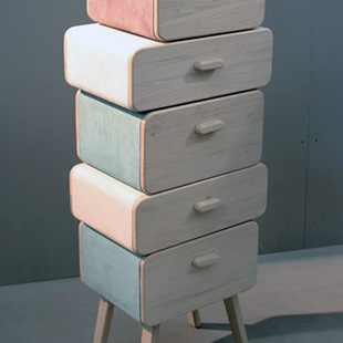
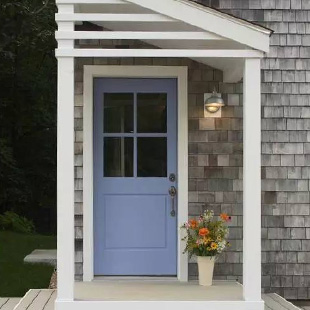
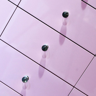
The world’s leading authority on color has set in motion a new trend through its selection of the two shades that will symbolize this year: Rose Quartz, a delicate, romantic pink, and Serenity, a soft, chic sky blue. It all adds up to an alchemy of light and reassuring nuances that blend into a renewed quest, the purpose of which is to transform the space in which we live, our home, into an oasis of tranquility, even in terms of its furnishings and interior design.
As consumers seek mindfulness and well-being as an antidote to modern day stresses, welcoming colors that psychologically fulfill our yearning for reassurance and security are becoming more prominent. Joined together, Rose Quartz and Serenity demonstrate an inherent balance between a warmer embracing rose tone and the cooler tranquil blue, reflecting connection and wellness as well as a soothing sense of order and peace.
Leatrice Eiseman -Director of the Pantone Color Institute.
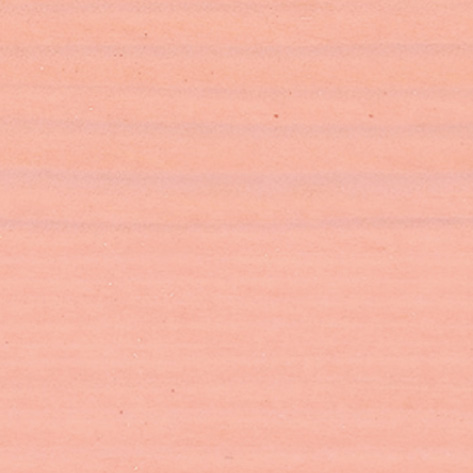
The 2016 Pantone colors are becoming true must-haves. And we wanted to interpret this emerging trend. How? By formulating two brand-new lacquered colors (P50000 and P50100), which are also available in the new MICRO MATTER microtextured top coats.
The two pastel shades, in all of their possible undertones, captivate the eye thanks to their capacity to adapt to various types of elements, both internal and external. By appealing to all finishes – matt, metallic and gloss – pink-tinged Rose Quartz and blue-tinted Serenity give rise to winning combinations and solutions, with myriad application options. Some examples?
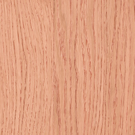
Ginepro e Curcuma
For those who love modern furnishings that exude the beauty and warmth of wood.
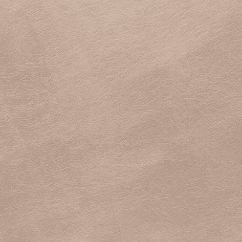
Oro rosa
The steel-effect top coat, which can be combined with the on-trend lacquered colors – perfect for refined, metropolitan spaces.
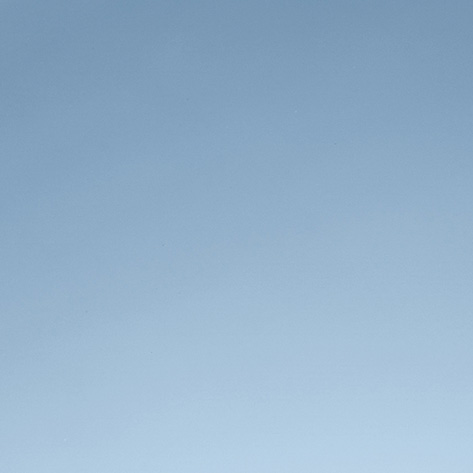
Sublimated mirror effect
The specific application for glass, with sublimated mirror effect.
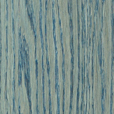
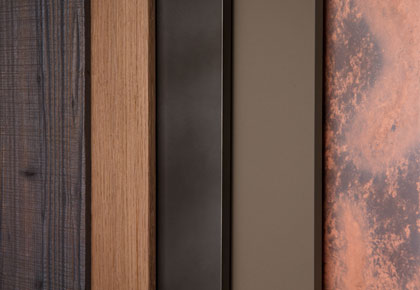
The Blu turchese and Rosa pesca pastel tones
Semi-hiding water-based impregnating agents for wood and frames/shutters, which are perfectly in synch with the styling of the latest interior designs.
So many possibilities, for a pastel-colored home that’s all about design and well-being. This really is chromotherapy!

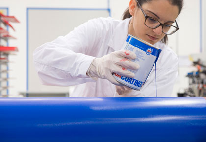 Our products are designed to protect and decorate wood and glass with a common denominator in mind: to combine innovation, high quality and low environmental impact.
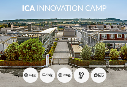
 The ICA Group world is constantly evolving, always attentive to design trends and to the requests of designers and architects. Our color and finish trends are a source of inspiration for the Italian and international market every day.
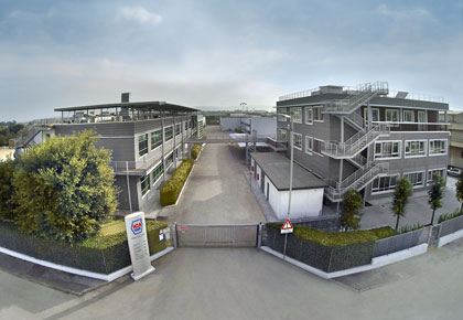 We are a big group with firm and deep roots. Thanks to our know-how, R&D investments, respect for the environment and high quality, we have become world leaders in innovative coatings for wood and glass.